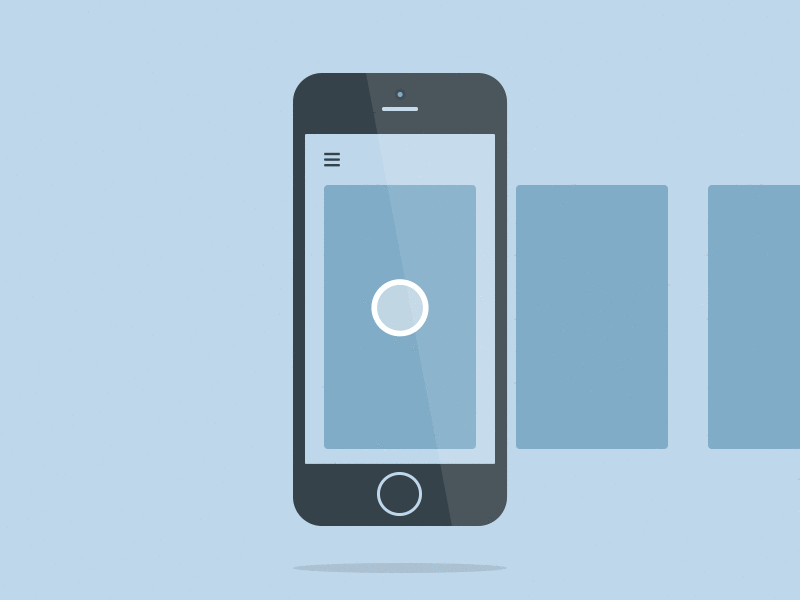
Create Tinder-like UI in Xamarin Forms using SwipeCardView

SwipeCardView is a lightweight MVVM friendly user control that brings Tinder-style swipe card view into Xamarin.Forms applications.
In this blog post I will talk about card based user interfaces and why they are better than newsfeeds, with the special attention to Tinder approach. Then I will cover in detail the design and the implementation of SwipeCardView.
If you are not interested in the background nor implementation details, feel free to jump to the usage example of this PCL library, which is available on NuGet and GitHub.

What Are Cards?
As defined in Android Material Design Guidelines, a card is a sheet of material that serves as an entry point to more detailed information. Or to put it simple, cards are those little rectangles full of inclusive images and text.
Before web and mobile apps, cards were always all around us — business cards, baseball cards, football sticker albums, and even sticky notes. Thus, it is more intuitive for us to know that these cards are representing piece of content just like in real life.
 Panini card: Batistuta
Some of the advantages of cards are:
- Chunking content: Cards divide content into meaningful sections, similar to the way text paragraphs group sentences into distinct sections.
- Easy to Digest: Cards are a great tool for communicating stories quickly. Users can easily access the content that they are interested in, and this empowers users to engage in any way they want.
- Visually pleasing: Card-based design usually heavily relies on visuals, because images draw the user’s eye efficiently and immediately.
- Responsive: They are a good choice for responsive design since cards act as content containers that can easily scale up or down.
- Designed For Thumbs: Cards have been developed with mobile apps in mind.
 Swiping. Source: Dribble
Cards vs. Newsfeeds
Newsfeeds are useful for reading stories, but not for making decisions.
The problem with newsfeeds is one of information overload. When scrolling through an endless list of options, it’s impossible to reach the end. Since there’s no way to review all the possibilities, it robs the user of a sense of finality.
Instead of infinite content rendered useless by its very vastness, cards connect with users via offering only the best possible content, one piece at a time. It’s the ideal UI for making a decision about now.
Looking at data one piece at a time is more efficient when you consider people you might want to date, restaurants, streaming music, or local events you might want to check out.
Tinder
Tinder has a terrifically simple card swipe interface — you swipe to the left if you’re not interested, to the right if you are. This card-swiping mechanism is curiously addictive, because every single swipe is gathering information. That means that every time a user browses profiles, it generates personal behavioral data.
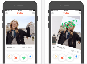 Tinder interface
Tinder is not the only app out there with swipe card interface. In fact, there are dozens of apps used in markets like: fashion, jobs, food etc.
Implementation design
Imagine you have to present to the user hundreds of cards, each with different content.
One options is to instantiate UI card control for each one of them, stack them one on top of each other and allow the user to swipe their way through the stack. Of course, this would be impractical in terms of memory and performance.
The other option is to create the minimum number of UI controls to show a card, and switch in the data as the user swipes through the cards. Basically you should instantiate as much UI controls as visible on the screen.
Let’s cover the minimum viable example of 2 visible cards at a time, which is beautifully explained in Xamarin.Forms Swipecard Tutorial by Matchbox Mobile.
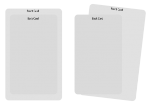 Image source: Matchbox Mobile
In starting position we have the front card (visible) and the back card (invisible). The back card is scaled to appear smaller than the front. When the user drags the front card to the left or the right, we’ll rotate the front card and scale up the back card to give the appearance of moving to the front.
We can have as many card data items as we need in a array or list. As the user swipes the front card away, we fill its place with the next card data item and show it at the back. This way we only ever need two UI controls to represent and endless stack of cards.
Matchbox’s example is written in code-behind, which made it hard to reuse and combine with applications that embrace MVVM pattern.
Why MVVM?
When writing application logic in code-behind, as grow in size and scope, complex maintenance issues can arise. These issues include the tight coupling between the UI controls and the business logic, which increases the cost of making UI modifications, and the difficulty of unit testing such code.
The Model-View-ViewModel (MVVM) pattern helps to cleanly separate the business and presentation logic of an application from its user interface (UI). Maintaining a clean separation between application logic and the UI helps to address numerous development issues and can make an application easier to test, maintain, and evolve. It can also greatly improve code re-use opportunities and allows developers and UI designers to more easily collaborate when developing their respective parts of an app.
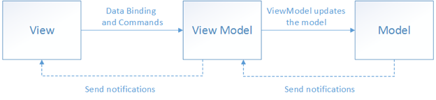 Image source: Xamarin
SwipeCardView
And finally we come to the implementation of SwipeCardView user control.
While creating it I had couple of goals in mind:
- It has to packed in lightweight and reusable Portable Class Library (PCL), so it could be deployed to NuGet
- The only dependency should be to Xamarin Forms framework
- All Xamarin.Forms platforms should be supported
- It has to be MVVM friendly: to be bindable to ViewModels and to support item templating and commands
- It should be able to consumed in XAML and any View can be used as a cell
Custom User Control
The concept of User Controls is not new, and exists in many different platforms including ASP.NET, XAML for Windows and Windows Phone as well as Web Forms. The User Control exposes properties allowing you to reuse the control while allowing each instance of the control to have different settings, layout, or behavior.
As per Xamarin documentation, the view which should be mostly used to create user control should be ContentView, and that’s exactly what we need.
ItemSource and ItemTemplate
We will be exposing bindable ItemSource and ItemTemplate properties, which should be used in exactly the same way like you would use ListView properties.
Creating bindable property and accessor:
public static readonly BindableProperty ItemsSourceProperty =
	BindableProperty.Create(
		nameof(ItemsSource),
		typeof(IList),
		typeof(SwipeCardView),
		null,
		propertyChanged: OnItemsSourcePropertyChanged);

public static readonly BindableProperty ItemTemplateProperty =
	BindableProperty.Create(
		nameof(ItemTemplate),
		typeof(DataTemplate),
		typeof(SwipeCardView),
		propertyChanged: OnItemTemplatePropertyChanged);
The ViewModel may change the collection that is bound to the ItemSource. For example the app was presenting cards with dog pictures, and now it changed to cats collection. And even further, collection could be changing over time. The client app may be adding new cat pictures to the collection in background, so user user never see empty card. SwipeCardView should handle both case, and for that reason we have OnItemsSourcePropertyChanged and OnItemSourceCollectionChanged.
private static void OnItemsSourcePropertyChanged(BindableObject bindable, object oldValue, object newValue)
{
	var swipeCardView = (SwipeCardView)bindable;
	var observable = oldValue as INotifyCollectionChanged;
	if (observable != null)
	{
		observable.CollectionChanged -= swipeCardView.OnItemSourceCollectionChanged;
	}

	observable = newValue as INotifyCollectionChanged;
	swipeCardView.Setup();
	if (observable != null)
	{
		observable.CollectionChanged += swipeCardView.OnItemSourceCollectionChanged;
	}
}

private void OnItemSourceCollectionChanged(object sender, NotifyCollectionChangedEventArgs e)
{
	if (this.cards[0].IsVisible == false && this.cards[1].IsVisible == false)
	{
		this.Setup();
	}
}
On the other hand, OnItemTemplatePropertyChanged has a task to instantiate N views (the number of visible views) using the template defined in the presentation layer of user application.
for (var i = 0; i < Math.Min(NumCards, this.ItemsSource.Count); i++)
{
	if (this.itemIndex >= this.ItemsSource.Count)
	{
		break;
	}

	var card = this.cards[i];
	card.BindingContext = this.ItemsSource[this.itemIndex];

	if (i == 0)
	{
		this.TopItem = this.ItemsSource[this.itemIndex];
	}

	card.IsVisible = true;
	card.Scale = this.GetScale(i);
	card.RotateTo(0, 0);
	card.TranslateTo(0, -card.Y, 0);
	((RelativeLayout)this.Content).LowerChild(card);
	this.itemIndex++;
}
Swipe Command
User application should be able to easily react on user swipes. That’s where SwipeLeftCommand and SwipeRightCommand come in:
public static readonly BindableProperty SwipedLeftCommandProperty =
	BindableProperty.Create(
		nameof(SwipedLeftCommand),
		typeof(ICommand),
		typeof(SwipeCardView));

public ICommand SwipedLeftCommand
{
	get { return (ICommand)this.GetValue(SwipedLeftCommandProperty); }
	set { this.SetValue(SwipedLeftCommandProperty, value); }
}
The magic – PanGestureRecognizer
The pan gesture is used for detecting dragging and is implemented with the PanGestureRecognizer class.
We need to know the touch start, moving, and end events, as well as the x and y location.
We will create it in the constructor and attach OnPanUpdated event:
var panGesture = new PanGestureRecognizer();
panGesture.PanUpdated += this.OnPanUpdated;
this.GestureRecognizers.Add(panGesture);

private void OnPanUpdated(object sender, PanUpdatedEventArgs e)
{
	switch (e.StatusType)
	{
		case GestureStatus.Started:
			this.HandleTouchStart();
			break;
		case GestureStatus.Running:
			this.HandleTouch((float)e.TotalX);
			break;
		case GestureStatus.Completed:
			this.HandleTouchEnd();
			break;
	}
}
Xamarin Form have simple but powerful animations. In our example we want to use 3 functions on our card View objects:
- RotateTo
- TranslateTo
- ScaleTo
When the touch starts, then only thing we have to do is to reset cardDistance.
// Handle when a touch event begins
private void HandleTouchStart()
{
	this.cardDistance = 0;
}
The interesting part comes in HandleTouch method. PanGestureRecognizer provides us info how much card translated horizontally. We just have to calculate current rotation angle, where we will use max desired angle – CardRotationAdjuster and current card distance. If the card translation is bigger than maximum card distance, we will update view background, so user can be aware that the card is already in area to be swiped away. At the end we will scale up the back card.
// Handle the ongoing touch event as the card is moved
private void HandleTouch(float differenceX)
{
	if (this.ignoreTouch)
	{
		return;
	}

	var topCard = this.cards[this.topCardIndex];
	var backCard = this.cards[this.PrevCardIndex(this.topCardIndex)];

	// Move the top card
	if (topCard.IsVisible)
	{
		// Move the card
		topCard.TranslationX = differenceX;

		// Calculate a angle for the card
		var rotationAngle = (float)(CardRotationAdjuster * Math.Min(differenceX / this.Width, 1.0f));
		topCard.Rotation = rotationAngle * DegreesToRadians;

		// Keep a record of how far its moved
		this.cardDistance = differenceX;

		if (Math.Abs((int)this.cardDistance) > this.CardMoveDistance)
		{
			if (this.cardDistance > this.CardMoveDistance)
			{
				topCard.BackgroundColor = Color.FromHex(SwipeRightBackgroundColor);
			}
			else
			{
				topCard.BackgroundColor = Color.FromHex(SwipeLeftBackgroundColor);
			}
		}
		else
		{
			topCard.BackgroundColor = Color.FromHex(DefaultCardBackgroundColor);
		}
	}

	// Scale the backcard
	if (backCard.IsVisible)
	{
		backCard.Scale = Math.Min(BackCardScale + Math.Abs((this.cardDistance / this.CardMoveDistance) * (1.0f - BackCardScale)), 1.0f);
	}
}
If cardDistance is bigger than the limit needed to swipe card off the screen, HandleTouchEnd will invoke appropriate command. Otherwise, it should translate and rotate card to starting position.
// Handle the end of the touch event
private async void HandleTouchEnd()
{
	this.ignoreTouch = true;

	var topCard = this.cards[this.topCardIndex];
	topCard.BackgroundColor = Color.FromHex(DefaultCardBackgroundColor);

	// If the card was move enough to be considered swiped off
	if (Math.Abs((int)this.cardDistance) > this.CardMoveDistance)
	{
		// move off the screen
		await topCard.TranslateTo(this.cardDistance > 0 ? this.Width : -this.Width, 0, AnimationLength / 2, Easing.SpringOut);
		topCard.IsVisible = false;

		if (this.SwipedRightCommand != null && this.cardDistance > 0)
		{
			this.SwipedRightCommand.Execute(this.ItemsSource.IndexOf(topCard.BindingContext));
		}
		else if (this.SwipedLeftCommand != null)
		{
			this.SwipedLeftCommand.Execute(this.ItemsSource.IndexOf(topCard.BindingContext));
		}

		this.ShowNextCard();
	}
	else
	{
		// Move the top card back to the center
		topCard.TranslateTo((-topCard.X), -topCard.Y, AnimationLength, Easing.SpringOut);
		topCard.RotateTo(0, AnimationLength, Easing.SpringOut);

		// Scale the back card down
		var prevCard = this.cards[this.PrevCardIndex(this.topCardIndex)];
		await prevCard.ScaleTo(BackCardScale, AnimationLength, Easing.SpringOut);
	}

	this.ignoreTouch = false;
}
XAML usage
At last, here is the example of how control should be used in XAML of your application:
<swipeCardView:SwipeCardView
                            ItemsSource="{Binding ViewModelItems}"
                            SwipedLeftCommand="{Binding SwipedLeftCommand}"
                            SwipedRightCommand="{Binding SwipedRightCommand}"
                            TopItem="{Binding TopItem}">
     <swipeCardView:SwipeCardView.ItemTemplate>
          <DataTemplate x:Name="SomeTemplate">
		<!-- Template -->
          </DataTemplate>
      </swipeCardView:SwipeCardView.ItemTemplate>
</swipeCardView:SwipeCardView>
- ViewModelItems is an ObrvableCollection defined in your ViewModel
- TopItem is observable property that should have the same type like the elements of the collection
- Template represent how each card should look like
Example
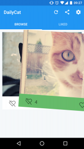
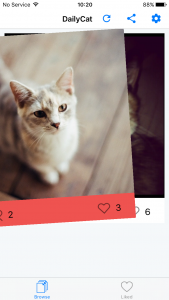
Full working example can be found on my GitHub repository. It’s an image gallery app called DailyCat.
<swipeCardView:SwipeCardView
                            ItemsSource="{Binding Cats}"
                            SwipedLeftCommand="{Binding SwipedLeftCommand}"
                            SwipedRightCommand="{Binding SwipedRightCommand}"
                            TopItem="{Binding TopCat}">
     <swipeCardView:SwipeCardView.ItemTemplate>
          <DataTemplate x:Name="CatTemplate">
              <Grid InputTransparent="True">
                  <Grid.RowDefinitions>
                      <RowDefinition Height="*"></RowDefinition>
                      <RowDefinition Height="50"></RowDefinition>
                  </Grid.RowDefinitions>
                  <Grid.ColumnDefinitions>
                      <ColumnDefinition Width="*"></ColumnDefinition>
                      <ColumnDefinition Width="*"></ColumnDefinition>
                      <ColumnDefinition Width="*"></ColumnDefinition>
                  </Grid.ColumnDefinitions>
                  <Image Grid.Row="0" Grid.Column="0" Grid.ColumnSpan="3" Source="{Binding ImageSource}" Aspect="AspectFill" VerticalOptions="FillAndExpand" HorizontalOptions="FillAndExpand"></Image>

                  <StackLayout Grid.Row="1" Grid.Column="0" Orientation="Horizontal" Spacing="10" HorizontalOptions="Center">
                      <Image Source="{x:Static resources:Images.Dislike}" WidthRequest="32" HeightRequest="32" VerticalOptions="Center"></Image>
                      <Label Text="{Binding DislikeCount}" FontSize="20" VerticalOptions="Center"></Label>
                  </StackLayout>
                  <StackLayout Grid.Row="1" Grid.Column="2" Orientation="Horizontal" Spacing="10" HorizontalOptions="Center">
                      <Image Source="{x:Static resources:Images.Like}" WidthRequest="32" HeightRequest="32" VerticalOptions="Center"></Image>
                      <Label Text="{Binding LikeCount}" FontSize="20" VerticalOptions="Center"></Label>
                  </StackLayout>
              </Grid>
          </DataTemplate>
      </swipeCardView:SwipeCardView.ItemTemplate>
</swipeCardView:SwipeCardView>


Go ahead and try it
You can download library from NuGet or check the source code on GitHub.
Some of the improvements that are coming:
- Exposing commands that would invoke swiping programmatically
- Adding support for custom overlays (as opposed to updating card background)
- Porting library to .NET standard
What do you think about the plugin? Do you find it useful? Feel free to let me know you opinions and ideas for future improvements.
Update
The new version of the library has a lot of improvements and new features. Check it out at: Introducing SwipeCardView 2.0