Introducing SwipeCardView 2.0
A year and a half ago I introduced SwipeCardView 1.0, a lightweight MVVM friendly user control that brings Tinder-style swipe card view into Xamarin.Forms applications. Since then, more than 1000 people downloaded the NuGet package, while the related blog post is no. 1 result on Google for “tinder xamarin”. This proves that people really need this kind of plugin, so I decided to introduce the version 2.0, with a lot of improvements and new features.
About
This netstandard2.0 library is intended for anyone who wants to build swipeable UI in C#. As it’s built on top of Xamarin.Forms, it works on Android, iOS and any other supported platform. If you are familiar with Xamarin.Forms ListView and SwipeGestureRecognizer interfaces, you will be able to utilize SwipeCardView with minimal effort. It’s highly customizable too, by giving you options to set supported directions, back card scale, rotation angle etc.


In this blog post I will be talking about the new stuff in 2.0. For the fundamentals of card based user interfaces and the design and the implementation of SwipeCardView 1.0, please check Create Tinder-like UI in Xamarin Forms using SwipeCardView.
SwipeGestureRecognizer
When Microsoft introduced SwipeGestureRecognizer in Xamarin Forms 3.2, I was excited to see its capabilities. Like the name says, it can detect swipe gestures but the story, unfortunately, stops there. While this nice feature is sufficient in some use cases, most of the people usually need visual feedback while performing the swipe movement. That’s where SwipeCardView steps in. In SwipeCardView 2.0 I replicated SwipeGestureRecognizer interface and added Dragging capabilities, which enable amazing UI feedback.
Interactivity
The biggest changes introduced in 2.0 are in the field of interactivity.
Supporting all directions
Earlier you would use SwipeLeftCommand and SwipeRightCommand to react to user swipes to left or right. Today SwipeCardView supports swiping to all 4 directions, represented with SwipeCardDirection enum:
| Name | Value | Description |
|---|---|---|
| None | 0 | Indicates an unknown direction |
| Right | 1 | Indicates a rightward swipe |
| Left | 2 | Indicates a leftward swipe |
| Up | 4 | Indicates an upward swipe |
| Down | 8 | Indicates a downward swipe |
SwipeLeftCommand and SwipeRightCommand are replaced with one SwipedCommand, which has SwipedCardEventArgs as parameter.
SwipedCardEventArgs
| Property | Type | Description |
|---|---|---|
| Item | System.Object | Gets the item parameter |
| Parameter | System.Object | Gets the command parameter |
| Direction | SwipeCardDirection | Gets the direction of the swipe |
Besides SwipedCommand I introduced Swiped event, for the use cases when you want to react to the swipe in code behind.
Responding to the swipe
An event handler for the Swiped event is shown in the following example:
void OnSwiped(object sender, SwipedCardEventArgs e)
{
    switch (e.Direction)
    {
        case SwipeCardDirection.None:
            break;
        case SwipeCardDirection.Right:
            break;
        case SwipeCardDirection.Left:
            break;
        case SwipeCardDirection.Up:
            break;
        case SwipeCardDirection.Down:
            break;
    }
}
The SwipedCardEventArgs can be examined to determine the direction of the swipe, with custom logic responding to the swipe as required.
The direction of the swipe can be obtained from the Direction property of the event arguments, which will be set to one of the values of the SwipeCardDirection enumeration. In addition, the event arguments also have a Parameter property that will be set to the value of the CommandParameter property, if defined. The item that the card is bound to can be obtained from the Item property.
Dragging event/command
SwipeGestureRecognizer uses PanGestureRecognizer under the hood. While the user is performing the movement, PanUpdated event is constantly being raised, and SwipeCardView uses this event to move the card around the screen. In order to give more control to the users over visual feedback, I introduced Dragging event/command, which is being raised from OnPanUpdated, carrying DraggingCardEventArgs. In previous version the library would be updating card background to green/red color when card is over threshold. This behavior is removed in favor of the Dragging event/command, and can be replicated easily, if needed.
DraggingCardEventArgs
| Property | Type | Description |
|---|---|---|
| Item | System.Object | Gets the item parameter |
| Parameter | System.Object | Gets the command parameter |
| Direction | SwipeCardDirection | Gets the direction of the swipe |
| Position | DraggingCardPosition | Gets the dragging position |
| DistanceDraggedX | double | Gets the distance dragged on X axis |
| DistanceDraggedY | double | Gets the distance dragged on Y axis |
The most useful property is Position, which is represented with DraggingCardPosition enum:
| Name | Value | Description |
|---|---|---|
| Start | 0 | Indicates a starting position |
| UnderThreshold | 1 | Indicates a position under threshold |
| OverThreshold | 2 | Indicates a position over threshold |
| FinishedUnderThreshold | 4 | Indicates an ending position under threshold |
| FinishedOverThreshold | 8 | Indicates an ending position over threshold |
Responding to the dragging
From the beginning of the movement until the end, SwipeCardView will be triggering Dragging events constantly.
private void OnDragging(object sender, DraggingCardEventArgs e)
{
    switch (e.Position)
    {
        case DraggingCardPosition.Start:
            break;
        case DraggingCardPosition.UnderThreshold:
            break;
        case DraggingCardPosition.OverThreshold:
            break;
        case DraggingCardPosition.FinishedUnderThreshold:
            break;
        case DraggingCardPosition.FinishedOverThreshold:
            break;
    }
}
The DraggingCardEventArgs can be examined to determine the position of the card, with custom logic that updates UI elements as required.
The position of the card can be obtained from the Position property of the event arguments, which will be set to one of the values of the DraggingCardPosition enumeration. The direction of the swipe can be obtained from the Direction property of the event arguments, which will be set to one of the values of the SwipeCardDirection enumeration. In addition, the event arguments also have a Parameter property that will be set to the value of the CommandParameter property, if defined. The item that the card is bound to can be obtained from the Item property. At last, there are DistanceDraggedX and DistanceDraggedY properties.
SupportedSwipeDirections and SupportedDraggingDirections
Often you don’t want users to drag cards nor to detect swipe in all directions. Using SupportedSwipeDirections and SupportedDraggingDirections you can pick just the right combination. These 2 properties are of type SwipeCardDirection. This enumeration has a FlagsAttribute attribute that allows a bitwise combination of its member values. As a result, you can write the following:
SupportedSwipeDirections="{Binding SupportedSwipeDirections}"
SupportedDraggingDirections="Right, Left, Up"
public SwipeCardDirection SupportedSwipeDirections => SwipeCardDirection.Right | SwipeCardDirection.Left;
InvokeSwipe
InvokeSwipe method replaces InvokeSwipeLeft and InvokeSwipeRight. It simulates PanGesture movement to the provided direction.
public Task InvokeSwipe(SwipeCardDirection swipeCardDirection, uint numberOfTouches, uint touchDifferenceX, TimeSpan touchDelay, TimeSpan endTouch)
Parameters
| Type | Name | Description |
|---|---|---|
| SwipeCardDirection | swipeCardDirection | Direction of the movement. Currently supported Left and Right. |
| System.UInt32 | numberOfTouches | Number of touch events. It should be a positive number (i.e. 20) |
| System.UInt32 | touchDifferenceX | Distance passed between two touches. It should be a positive number (i.e. 10) |
| System.TimeSpan | touchDelay | Delay between two touches. It should be a positive number (i.e. 1 millisecond) |
| System.TimeSpan | endDelay | End delay. It should be a positive number (i.e. 200 milliseconds) |
Customization
I got couple of requests to expose internal constants properties of the library. For that reason, in SwipeCardView 2.0 you have 3 new bindable properties:
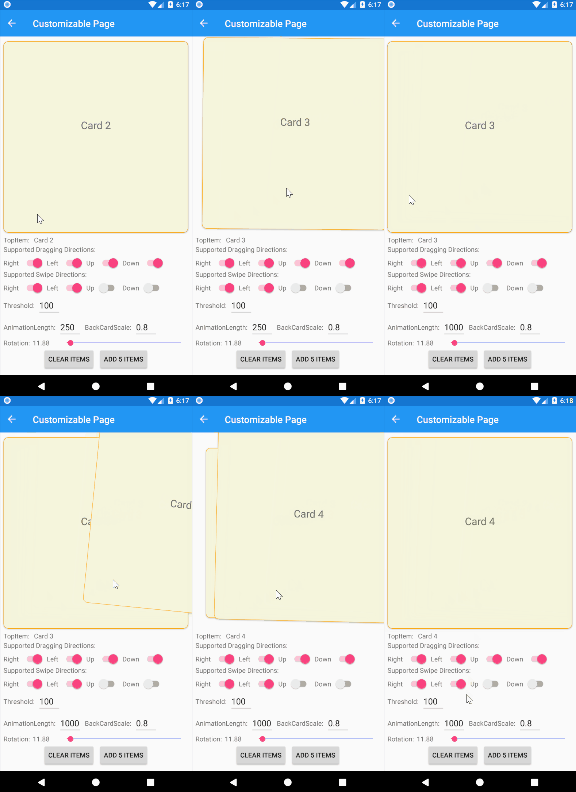
AnimationLength
The duration in milliseconds of the animation that occurs at the end of dragging movement. If the card was dragged over threshold and swipe is supported for that direction, the card would be animated out of the screen. If not, the card would be brought back to the starting position.
Below is an example of dragging over and under threshold with animation length set to 250 and 1000 milliseconds:
BackCardScale
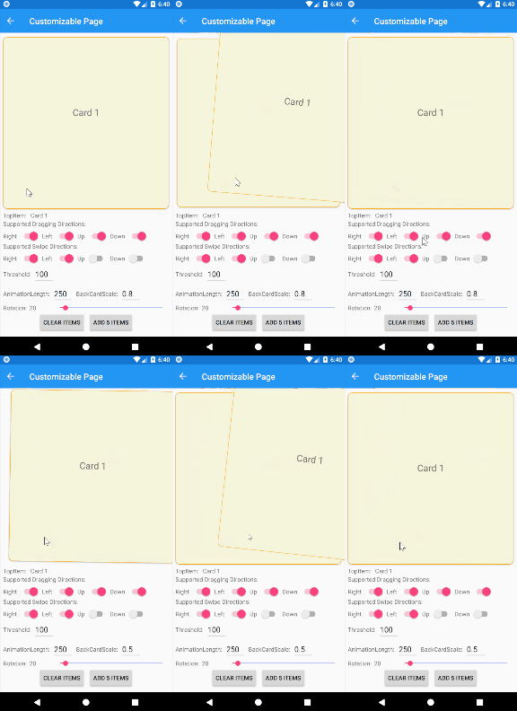
The value represents the scale of the back card at the beginning of the dragging movement. While the front card is being dragged closer to the threshold, the back card is being scaled up. It reaches value of 1 when the front card reaches the threshold.
Difference between BackCardScale being 0.8 and 0.5:
CardRotation
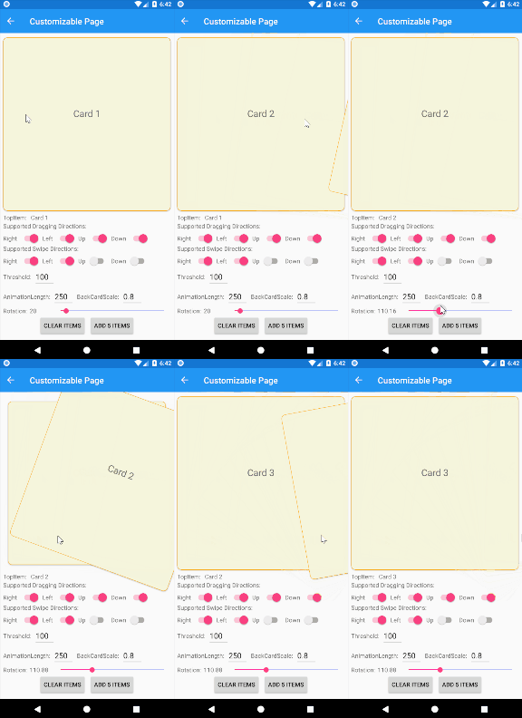
Rotation adjuster in degrees for dragging to left or right. Zero value means no rotation, while 360 means that the card will make a full circle.
Samples
I created 4 samples that show capabilities of the library. You can easily try them yourself by cloning the project from my GitHub repo.
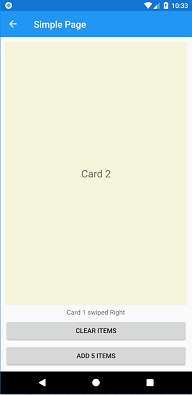
Simple Page
The intention of this sample is to show how simple it is to start using SwipeCardView in your MVVM app. All you need is a collection of items and a command handler.
<swipeCardView:SwipeCardView
    ItemsSource="{Binding CardItems}"
    SwipedCommand="{Binding SwipedCommand}"
    VerticalOptions="FillAndExpand">
    <swipeCardView:SwipeCardView.ItemTemplate>
        <DataTemplate>
            <Label Text="{Binding .}" FontSize="Large" HorizontalTextAlignment="Center" VerticalTextAlignment="Center" BackgroundColor="Beige"/>
        </DataTemplate>
    </swipeCardView:SwipeCardView.ItemTemplate>
</swipeCardView:SwipeCardView>
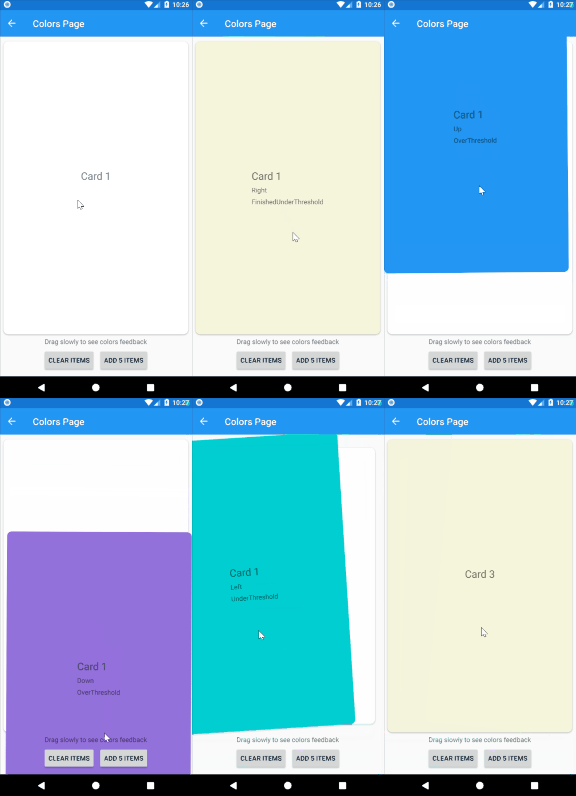
Colors Page
The intention of this sample is to demonstrate the SwipeCardView interactivity. Each color represents one DraggingCardPosition. Labels on cards represent the current values of SwipeCardDirection and DraggingCardPosition.
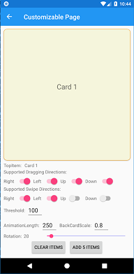
Customizable Page
The intention of this page is to demonstrate the use of all the properties of SwipeCardView. All the properties can be updated in runtime using the UI controls below:
Tinder Page
The intention of this sample is to replicate Tinder UI.


Other remarks
- While developing SwipeCardView 2.0 I tried to follow .NET standard library guidance
- This library has nothing to do with Machine Learning. MLToolkit is just an unique prefix
Conclusion
I hope all these improvements will make SwipeCardView more usable plugin and that it will help you create amazing swipeable UI. Give it a try and let me know what you think.
Here are some useful links:
GitHub repo NuGet package Documentation SwipeCardView API Change Log – November 2018
